This is Part 2 of my Beyond the Words series exploring the various and sundry ways in which you can add multimedia such as images, videos, audios, and downloadables (PDFs) to your website to spice it up.
Everyone know that adding images to your blog posts and pages makes them 10 times more interesting, right? Who wants to stare at just words on the screen any longer.

Statistics show that posts with relevant images get something like 94% more engagement (people being willing to read, share and engage with your post) than content without.
That’s astounding and that’s from a study done more than 4 years ago. With the huge shift toward more visual engagement with social media sites like Facebook and Pinterest (and even Twitter and LinkedIn are on the band wagon now, too), I know that number still stands if today if it’s not even higher.
But there’s a right way to do images in your blog posts and a less-than-right way both from a strategic standpoint as well as from a practical, clicking-all-the-right-buttons in WordPress way, and I’m going to share a few tips here about both.
Consuming content is like a hobby to me.
I follow lots of blogs – all kinds from business-focused, website design and development, SEO, and then the more entertaining mommy blogs that I follow – oh and food porn blogs – yeah, baby! I mean, I read a lot of blogs.
At last count, I was subscribed to like 113 (which is a little ridiculous now that I’ve actually counted them all) in my Feedly stream. (Feedly is an RSS reader that’s a bit of a relic from the last decade. Not many people use RSS readers any longer, but they let you easily keep tabs on tons of sites without a whole lot of effort and without having to flood your inbox every single day with hundreds of new blog posts. But I digress…)
Tip #1: choose RELEVANT images.
Anyhow. I don’t seriously read an average of 200-300 blog posts a day. But I do do a lot of skimming – looking for those gems that jump out at me and are either relevant to something I do for myself in my business or might be valuable to my clients and readers and are worth sharing.
In my skimming, of course one of the first things that will catch my eye is a compelling image. And I probably spend more time than most people trying to figure out how an image ties into the content of an article. But even if not everyone is geeky like me, subconsciously, they’re looking for that connection, too – not just a snag-your-attention stock photo but something that draws them into the content of the blog post, grabs their attention with the picture, and doesn’t let go with the words.
There can be a loose connection but make it a connection none the less.
Tip #2: Be intentional about the images you’re including – how many and where you’re plugging them in.
I’ve noticed this especially on food blogs – some people will post 8 or 9 images in a blog post that is less than 500 words long. Not necessary and really irritating waiting for all those images to load while I’m trying to scroll and read the article quickly.
I get it, especially when you’re sharing a recipe or something – lots of images to illustrate specific steps along the way in preparing the dish are useful. But showing 3 almost identical shots with hardly any variation is really just wasting my bandwidth. Maybe that’s not as relevant when you’re writing more business-oriented blog posts, but either way, just don’t do it.
Use 2 or 3 key images strategically placed to break up long stretches of text. And don’t be afraid to use captions on those images because people read captions. (Who knew?!)
Tip #3: Make sure your images are optimized
You desperately want your images to load quickly, especially for the 50% or more of people these days who are consuming your content on their phones.
There are some steps you should take before you ever add an image to your Media Library or touch that ADD MEDIA button. I’ll cover those in a future post in this series, but taking some time beforehand will pay off for you in SEO and social media benefits as well as less hassle for yourself down the road when you’re trying to find it again. (I can’t be the only one this happens to.)
OK, let’s get to some of the nitty gritty.
(Bet you thought this article was going to be a How-to about adding images to your WordPress blog posts, didn’t you – so did I?!)
So once you’ve done this prep (that I have yet to tell you about), you’ll want to finally put that image into your post.
The super-duper easy way to get it there is to drag it from wherever you’ve saved it on your computer and drop it right smack into your blog post editor.
Or, you can do it the old fashioned way (which gives me a warmer, fuzzier feeling of having more control over where it’s going to end up) by first positioning your cursor where you want it to go and then clicking the ADD MEDIA button and dragging the image into that screen.
Once the image is uploaded, be sure, without fail, to give it a Title and Alt Text. The Alt Text especially gets used for screen readers for someone who might be visually impaired, so don’t skip that part.
Google reads the Alt Text, too
It actually can help with your search engine rankings. Your image Title and Alt Text are really good places to include keywords you’re trying to optimize your article for. And then take 2 seconds to add a description of the image. This one is mostly for your internal use since most themes I’ve worked with (and code for my clients) don’t use the description in a public-facing way. But this is another instance where your future self will thank you if you do. When you’re searching for images in the Media Library, the text you include as a description is searchable, so it will help you find that image again when you want to re-use it.
Now you have some choices to make about how to insert the image into your content.
Alignment
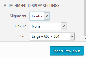
I recommend choosing either center or right alignment. (Again with the studies here, but…) Studies have shown that you don’t want to interrupt the left margin on screens if at all possible because it impedes people’s line of reading. So, if you want a smaller version of the image, be sure and choose right alignment. If you want a bigger version of the image, go ahead and let it fill the full-width of your content column and choose none or center for your alignment. (Center alignment looks nicer if it’s not quite a full width image.)
Link To
Unless there is a specific reason that you want your image to link to something when someone clicks it (for instance, having a super big version of an infographic available for people to be able to magnify) or the image is associated with downloading a document, then choose NONE for the Link To field. You’re basically giving someone a reason to click off your article (because who can resist clicking on something that’s clickable – curiosity just gets the best of you) if you chose Attachment or Media. There’s no sense in doing that – you want people to keep reading and stay engaged.
Size
It helps to know a little about your theme in order to choose your size appropriately. Ideally, your Media Sizes (under SETTINGS / MEDIA) are already set appropriately. I typically make sure my LARGE size media is set to the full width of my content column, the MEDIUM size about half of that and then leave the THUMBNAIL at 150×150 (so it will crop an image to be a small square thumbnail).
Choose the size that’s closest to what you want to use it for. Again, this helps with optimizing your content so it loads fast for your readers.
Once those decisions are made, go ahead and click the INSERT INTO POST button and BAM! – beautiful image in your shiny new blog post. There you go.
Next time, in part 3 of the Beyond the Words series, we’ll talk about steps you want to take with your images before you even think about uploading them to your website. It gets to be a lot, I know, but it’s worth it to create a positive experience for your readers.